[vc_row animate=””][vc_column][vc_column_text]
[vc_row animate=””][vc_column][vc_column_text]
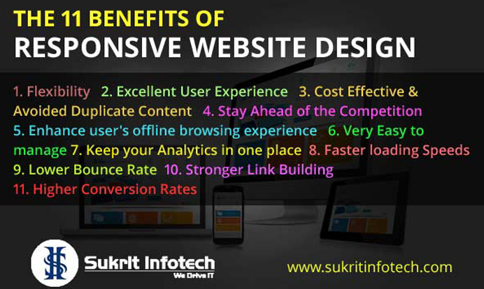
The 11 Benefits of Responsive Website Design
[/vc_column_text][vc_separator][vc_row_inner][vc_column_inner width=”2/3″][vc_column_text]
Responsive web site design is the method to developing a internet website so that it responds to the end user’s viewing environment, platform, screen-dimension and viewing orientation. Nowadays users browse websites on a mess of devices consisting personal computers, Laptops, Smartphone’s, Tablet and even their TV, therefore, a Responsive website design is need of the hour now.
If search engine optimization services India is a major part of your digital marketing strategy, similarly mobile responsive website is also a major part of web designing and web development. Mobile sales have already overtaken computer device sales, and mobile internet utilization is already overtaken computing device internet. So it is a very logical point that mobile search will also overtake computer search sooner in near future.
[/vc_column_text][/vc_column_inner][vc_column_inner width=”1/3″][vc_single_image image=”13875″ img_size=”full” alignment=”right”][/vc_column_inner][/vc_row_inner][vc_column_text]
What is Responsive Web Design and what is part of Responsive Web Design?
Responsive web design services in india is a technique of laying-out and building an internet website such that the internet website offers an optimal viewing experience to users— ease of reading and navigation with no resizing, panning, and scrolling — across a wide range of gadgets from computer to small screen mobile device. The designing and development of a responsive website includes blends of flexible grids and layouts, images and an intelligent use of CSS media queries.
Benefits of Responsive Website Design
[/vc_column_text][/vc_column][/vc_row][vc_row animate=””][vc_column width=”1/2″][vc_column_text]
Flexibility
[/vc_column_text][vc_separator][vc_column_text]
Your content is flexible enough to move seamlessly from the screen of one device to the other with responsive layout, which means that customers have the flexibility to browse your website on any kinds of their gadgets without distorted content or sluggish loading.
[/vc_column_text][/vc_column][vc_column width=”1/2″][vc_column_text]
Excellent User Experience
[/vc_column_text][vc_separator][vc_column_text]
Your content material may be king within the digital marketing realm, but if your users can not browse to it without any trouble, it is not beneficial for you. When you make your website responsive, the content will come to the web page quickly and without distortion and sluggish loading. There’s no manual resizing necessary to get it to fit on the small screen; the responsive web design attracts more customers to your business.
[/vc_column_text][/vc_column][/vc_row][vc_row animate=””][vc_column width=”1/4″][vc_single_image image=”13878″ img_size=”full”][/vc_column][vc_column width=”3/4″][vc_column_text]
Cost Effective & Avoided Duplicate Content
[/vc_column_text][vc_separator][vc_column_text]
A primary advantage of having a responsive website is that it takes less time and cost than making a separate stand-alone website for mobile, which has been the traditional approach. Testing across a number of websites also additionally increases your development, support, and maintenance overhead. Thanks to Panda algorithm of Google and the recent update in Google’s search ranking algorithm, replica content material can majorly down your website rankings in search engine result. Separate websites for mobile and desktop places you at the chance of running duplicate content on the website. Now that Google is also including mobile-responsive website into their rankings, content published at the mobile responsive website over along with your desktop website that means that you may be publishing duplicate content without realizing it.
[/vc_column_text][/vc_column][/vc_row][vc_row animate=””][vc_column width=”1/2″][vc_column_text]
Stay Ahead of the Competition
[/vc_column_text][vc_separator][vc_column_text]
Many websites owners are still not paying their attention to the need for responsive web design and modification to the website. Therefore in case, your website is responsive, the probability is you may be one step ahead of your competition.
[/vc_column_text][/vc_column][vc_column width=”1/3″][vc_single_image image=”13880″ img_size=”full” alignment=”right”][/vc_column][/vc_row][vc_row animate=””][vc_column width=”1/4″][vc_single_image image=”13881″ img_size=”full”][/vc_column][vc_column width=”3/4″][vc_column_text]
[/vc_column_text][/vc_column][vc_column width=”1/2″][vc_column_text]
Enhance user’s offline browsing experience
[/vc_column_text][vc_separator][vc_column_text]
It’s turning into increasingly more important for web-based applications to be on accessible even offline .Thankfully, application cache and different offline techniques provide us a way to keep our services accessible even when the user is without an internet connection.
The Application Cache (or AppCache) lets a developer specify which files the browser ought to cache and make to be accessible to offline customers. Your web application will load and work successfully, even though the user presses the refresh button even as they’re offline.
[/vc_column_text][/vc_column][/vc_row][vc_row animate=””][vc_column width=”2/3″][vc_column_text]
Very Easy to manage
[/vc_column_text][vc_separator][vc_column_text]
Having separate website for computer and mobile needs separate search engine optimization campaigns. Dealing with one website and one search engine optimization campaign is less difficult than handling two websites and search engine optimization campaigns. This is a key advantage a responsive website has over a separate mobile website. That being said, there are many advantages of having a mobile-precise search engine optimization technique, which includes optimizing for keywords which might be much more likely to be searched when a person is on their Smartphone. As an instance, a person performing a search for a local restaurant on mobile can be more probability to use the word “close by or nearby” in their search query. However, a separate online mobile website is not always a demand for a mobile search engine optimization strategy, and there’s no reason why mobile-specific keywords can’t be included into a responsive design website as well.
[/vc_column_text][/vc_column][vc_column width=”1/3″][vc_single_image image=”13882″ img_size=”full” alignment=”right”][/vc_column][/vc_row][vc_row animate=””][vc_column width=”1/4″][vc_single_image image=”13883″ img_size=”full”][/vc_column][vc_column width=”3/4″][vc_column_text]
Keep your Analytics in one place
[/vc_column_text][vc_separator][vc_column_text]It is very simple to understand that having a single URL means a single set of analytics to look at and decipher making it less difficult to examine the goals you have set and the funnels your website visitors have traveled through to attain those goals. Monitoring and analytics are some of the most crucial factors of a successful website, and when you have a responsive website layout, you could track and analyze all of these reports on single, easy to read. It lets you compare and contrast what is working properly and what’s not for all gadgets, and it gets rid of the confusion that comes from multiple reports.[/vc_column_text][/vc_column][/vc_row][vc_row][vc_column][vc_column_text]
Faster loading Speeds
[vc_separator][vc_column_text]
Unfortunately, the average web page load time for all devices is seven seconds, that’s substantially slower than the ideal time of one second. 40% of all mobile customers will abandon a web page if it takes more than 3 seconds to load. This definitely illustrates the necessity of quicker loading times for mobile devices, which is something responsive website design can deliver.
Lower Bounce Rate
[/vc_column_text][vc_separator][vc_column_text]Approximately half of all internets users file difficulty in viewing a static website, which forces them to leave the website and go to a competitor’s website rather. Whilst your website isn’t mobile responsive, the speed of your website and the look of the content is a critical problem, contributing to a drastically higher bounce rate.[/vc_column_text][vc_separator][vc_column width=”1/4″][/vc_column][vc_column width=”3/4″][vc_column_text]
Higher Conversion Rates
[/vc_column_text][vc_separator][vc_column_text]Responsive design layout approach that your customers can make purchases immediately thru your secure website in place of being re-directed to a device-specific website, which takes time and often crashes. The convenience of creating a transaction on a page that user can trust results in accelerated conversions and fewer customers lost to competitor websites.[/vc_column_text][/vc_column][/vc_row]